I really like the simplicity of this advert and it really captures the elements of the denim jeans and that is its unique selling point. I love the colours also! This is by Jack Stoneman.
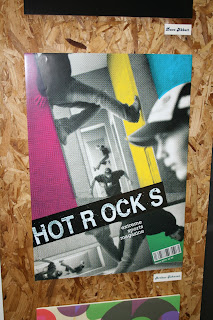
I really love the composition of this magazine cover it deffinetley has edge and it captures the audiences attention successfully. I love how certain parts of the wall are coloured and the layout is really good. This is by Aurthur Johnson.
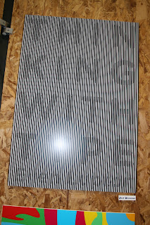
This poster is really clever and it plays with your vision really well. It deffinetly catches my attention. I also like the simplicity of it. This is by Jack Stoneman.
This really is lovely. I like the picture as it has really captured the texture of the hair and its movement. It is very very simple and it is kept well in theme with Toni & Guy current adverts. This is by Molly Jones.
This is really beautiful! I am very jealous of this poster! ;) It is very vintage and flows very well together. I love the colours also! This is by Chantel Williams.
I think this Coca-Cola advert is very clever. It is very abstract but it connects with the audience and most young people relate and connect to it. It is also very simple but it works very well! This is by Nathan Denny.
This poster is really crazy! (In a good way) I love the randomness of it but is all has relevance to the festival. I love the clock bit it is a very clever way to display the date of the festival. This is by Katie Marshall.
I really love the colours and the layout of this poster. I love how it is not readable and legable but it really works! This is by Lexie Mulholland.
I have taken some pictures of other peoples work which are my favorite in the show. I really love other peoples styles and outcomes and shows our potential and development. Well Done every one great show :)


No comments:
Post a Comment